INFORMATION GRAPHICS
Institution: TED University, Visual Communication Design | 2026
Instructors: Alper Yıldırım
Semester: 1 (3rd and 4th year students)
Course Brief
Information is never neutral. It is selected, structured, framed, and translated through design. This course examines how information can be clarified, interpreted, distorted, or concealed through visual systems.
Across five progressively complex projects, students work with infographics, data storytelling, pharmaceutical information, signage, and speculative anti-information systems. The course combines typography, visual hierarchy, layout, semiotics, and accessibility with critical questions concerning audience, ethics, framing, and visual authority.
Learning Outcomes
By the end of the course, students will be able to:
Analyse and critically evaluate existing visual information systems.
Organise complex information through typography, hierarchy, layout, and accessible design.
Create ethical and engaging data-driven visual communication.
Develop coherent speculative systems for fictional spaces and contexts.
Critically examine the limits of clarity, legibility, and user-centred design.
Project 01
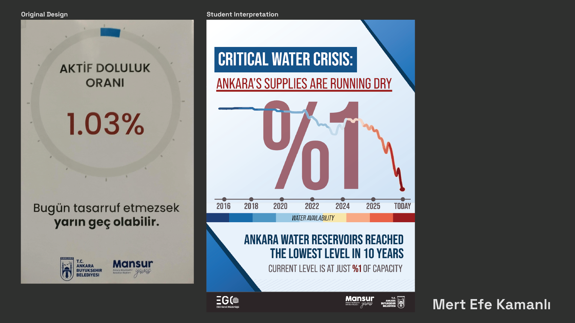
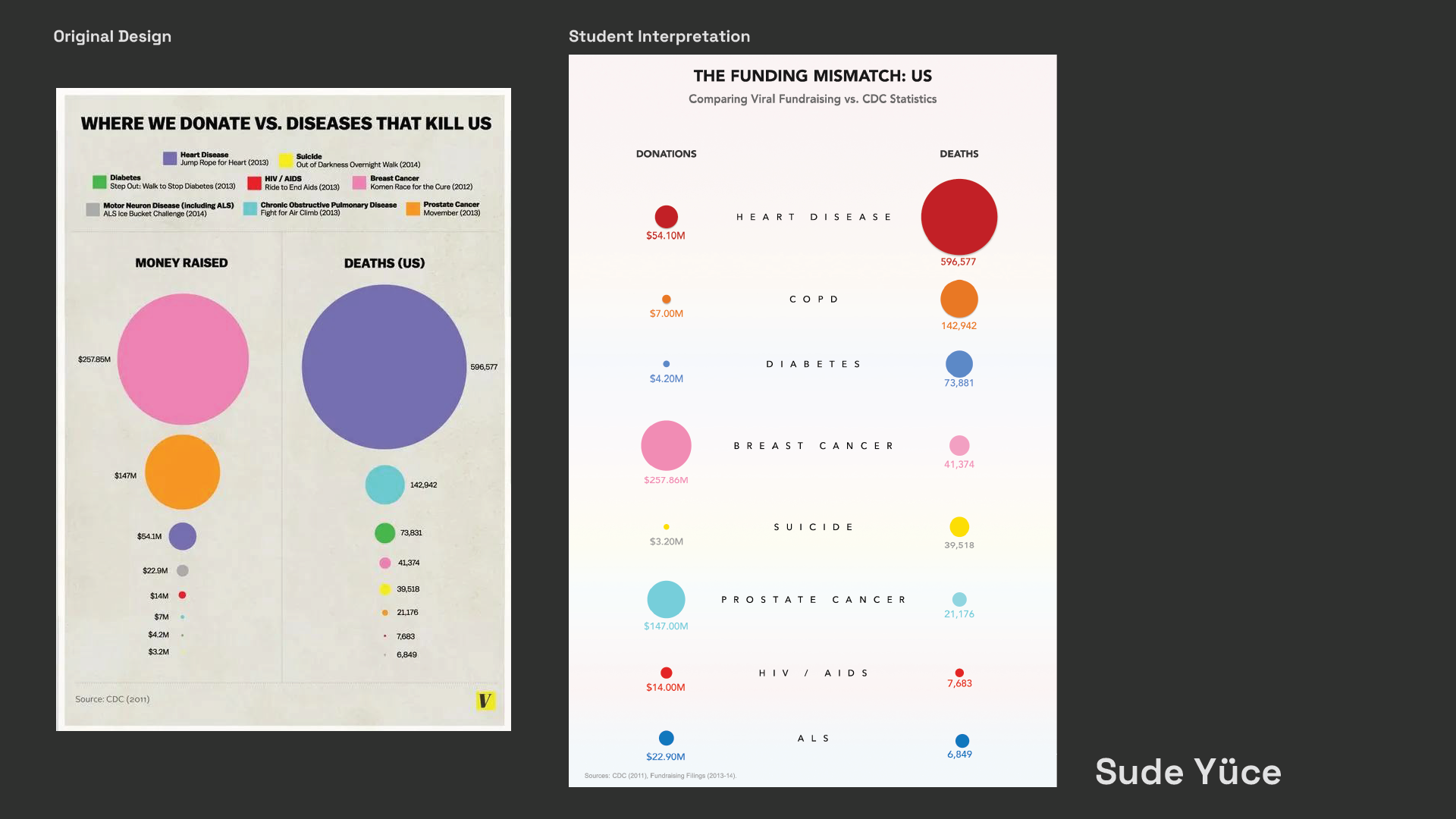
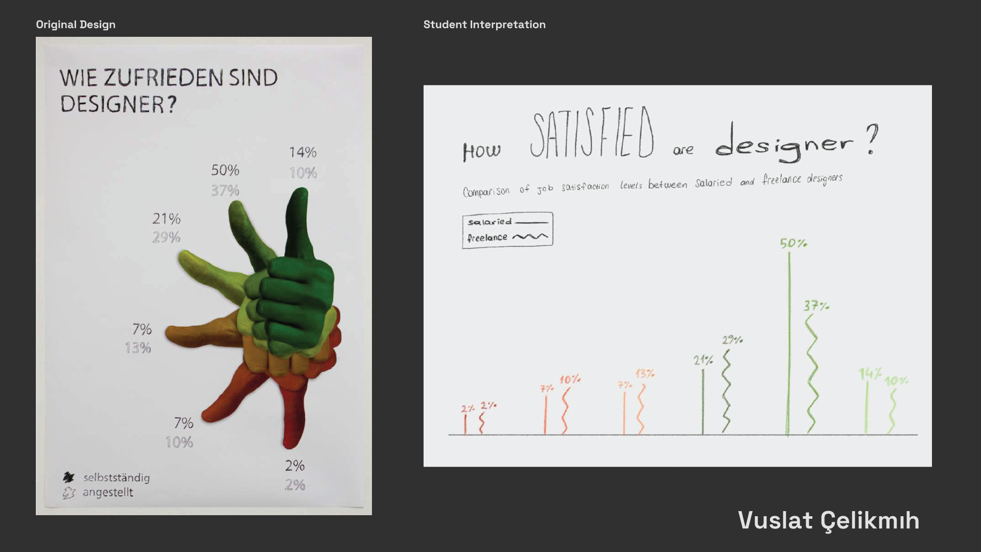
Fix That Infographic!
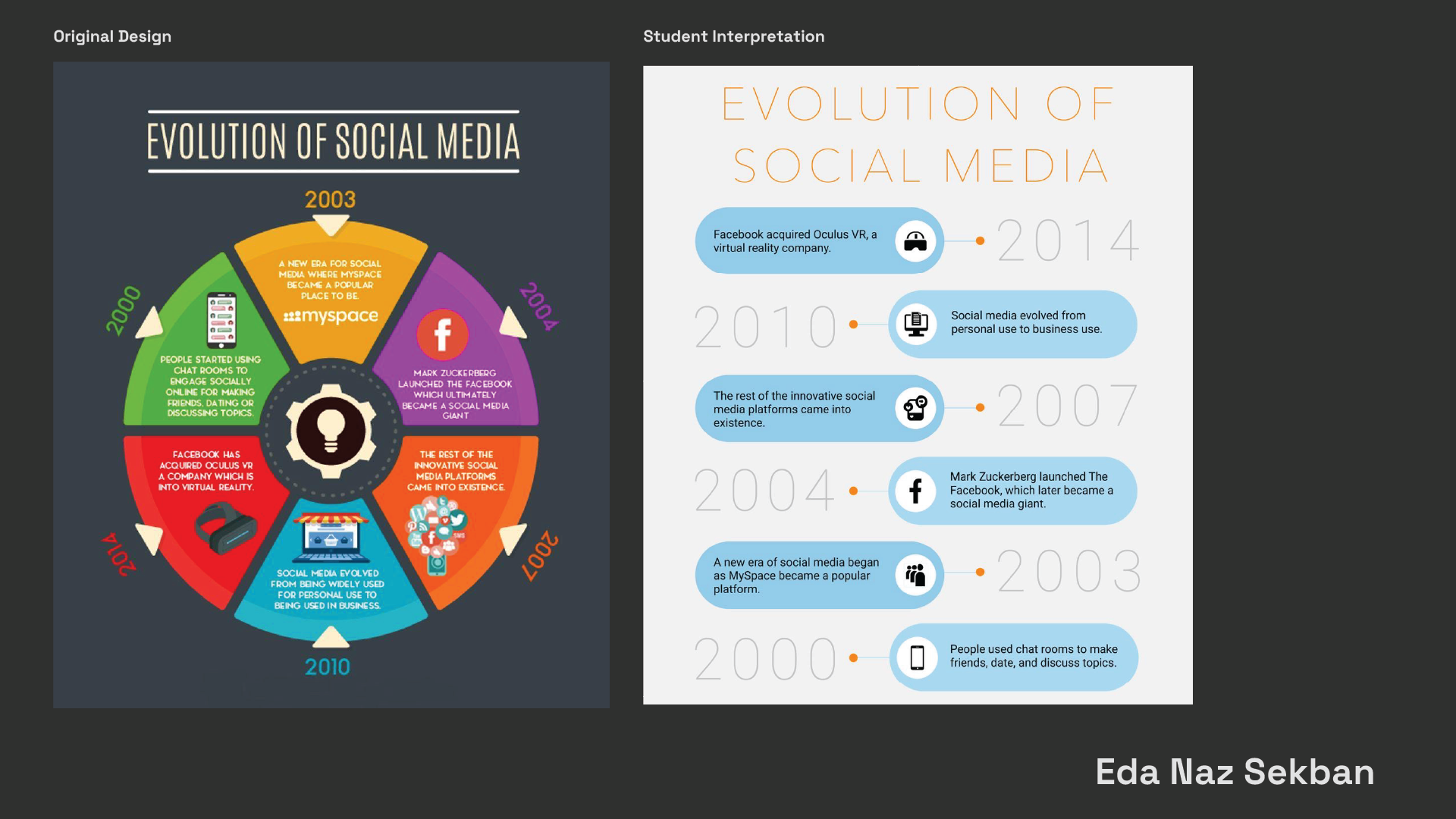
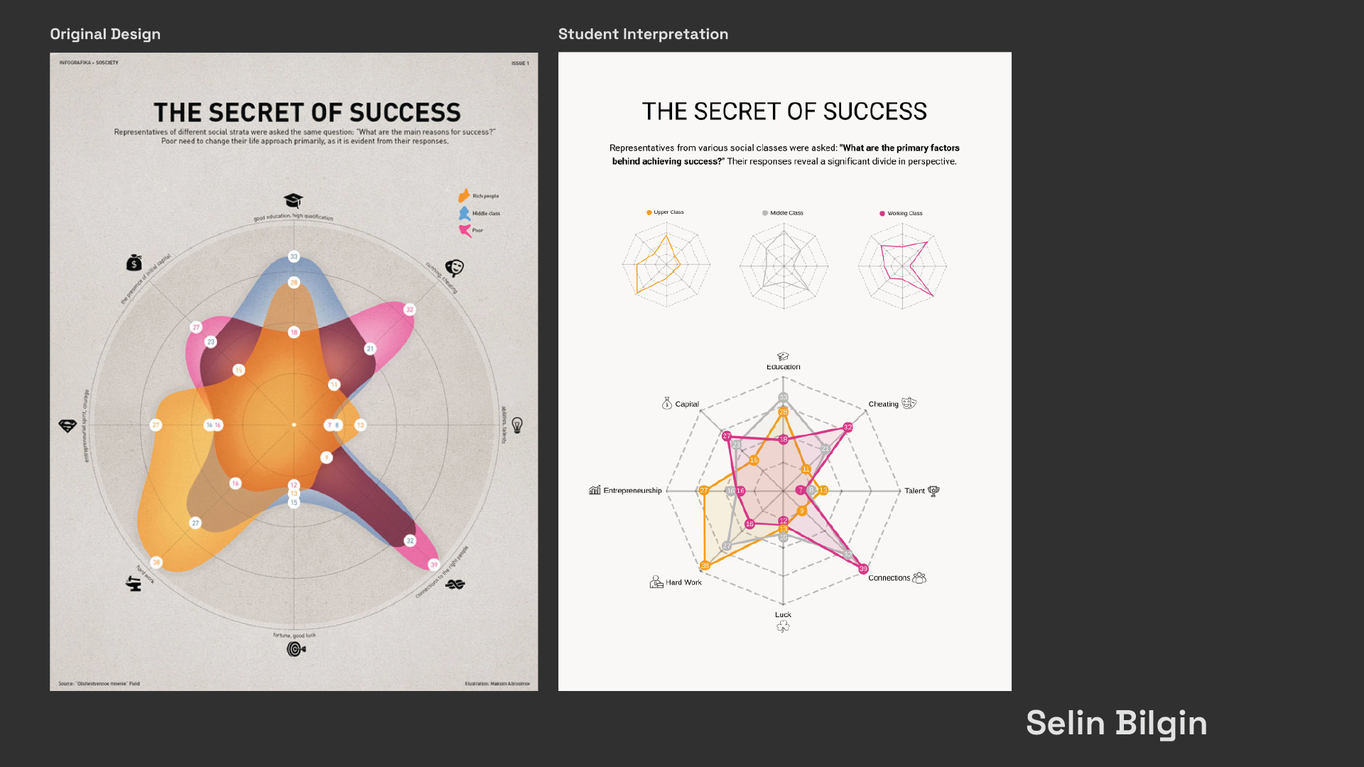
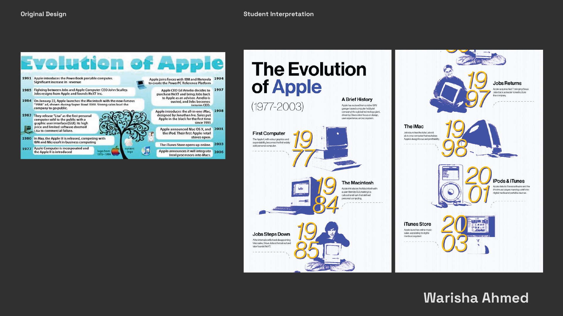
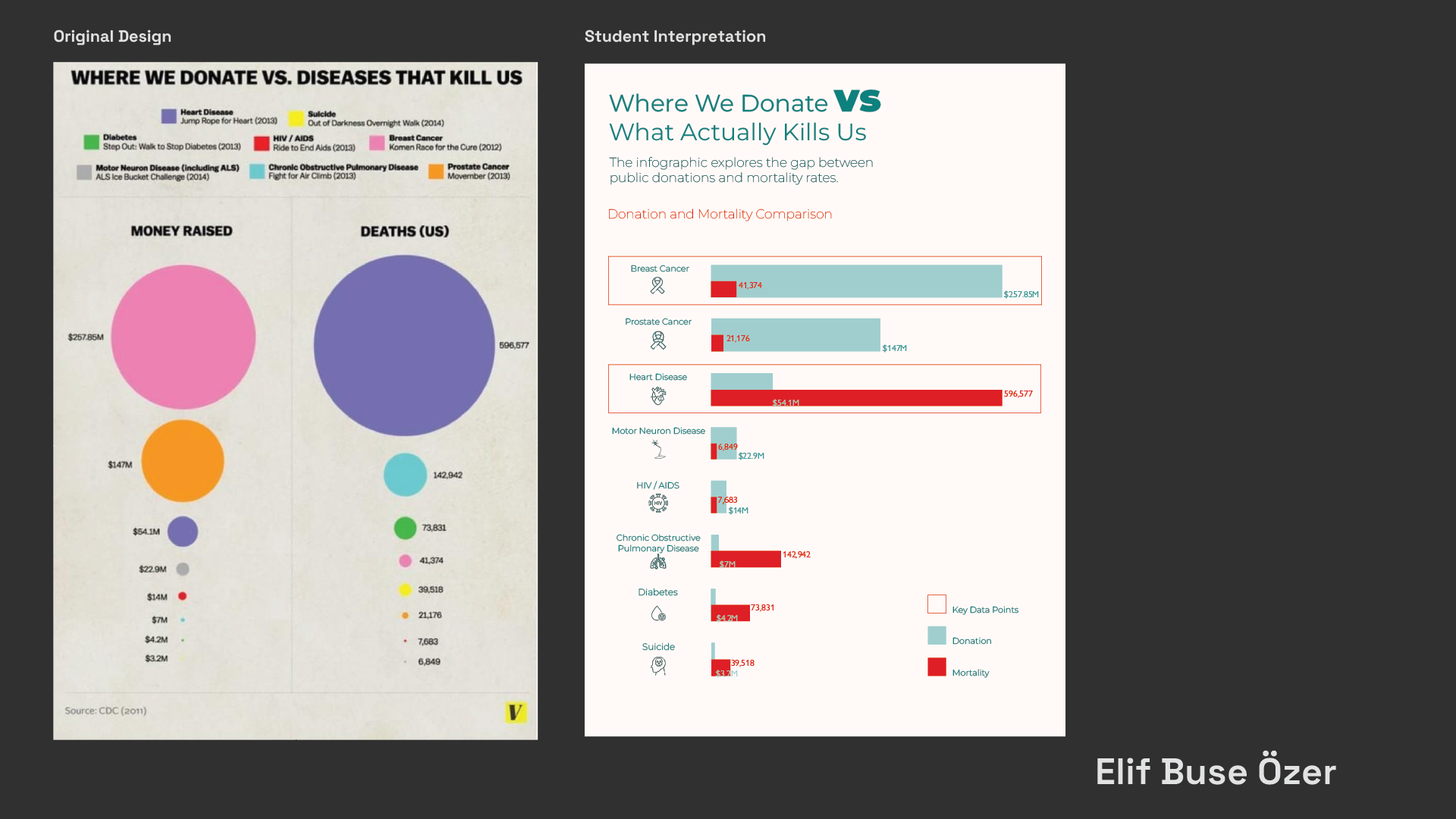
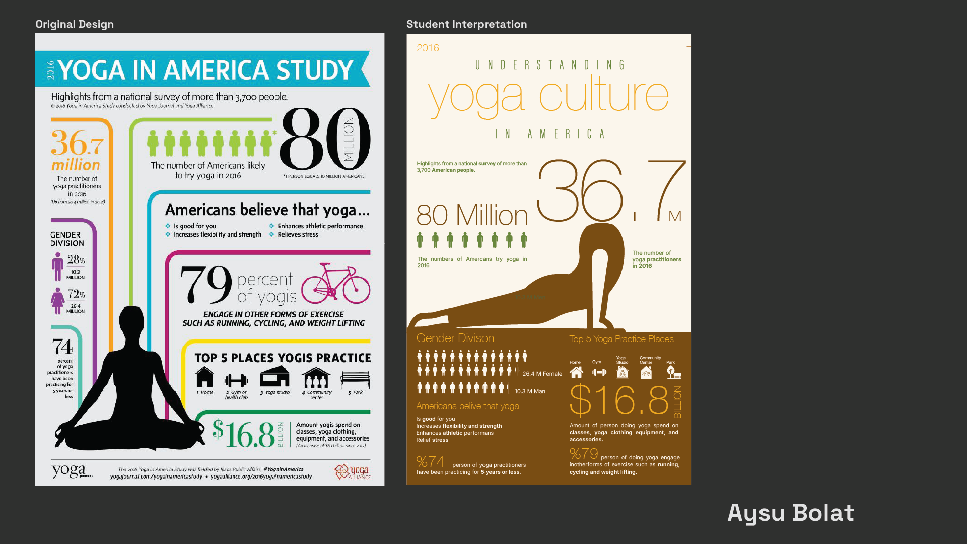
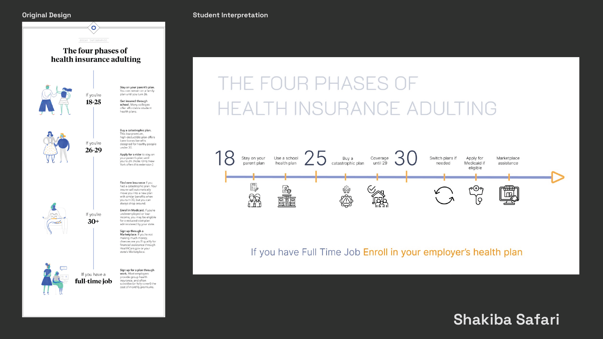
Students select an existing infographic that fails visually, structurally, ethically, or in relation to its intended audience. Before redesigning it, they analyse the original work and identify the problems affecting its readability, accuracy, hierarchy, and communication.
They then redesign the infographic to create a clearer, more effective, and visually coherent outcome. The project encourages students to treat redesign not as decoration, but as a process of recognising communication problems and making informed design decisions.
Selected Student Works
Project 02
Designing the Ethical Dilemma
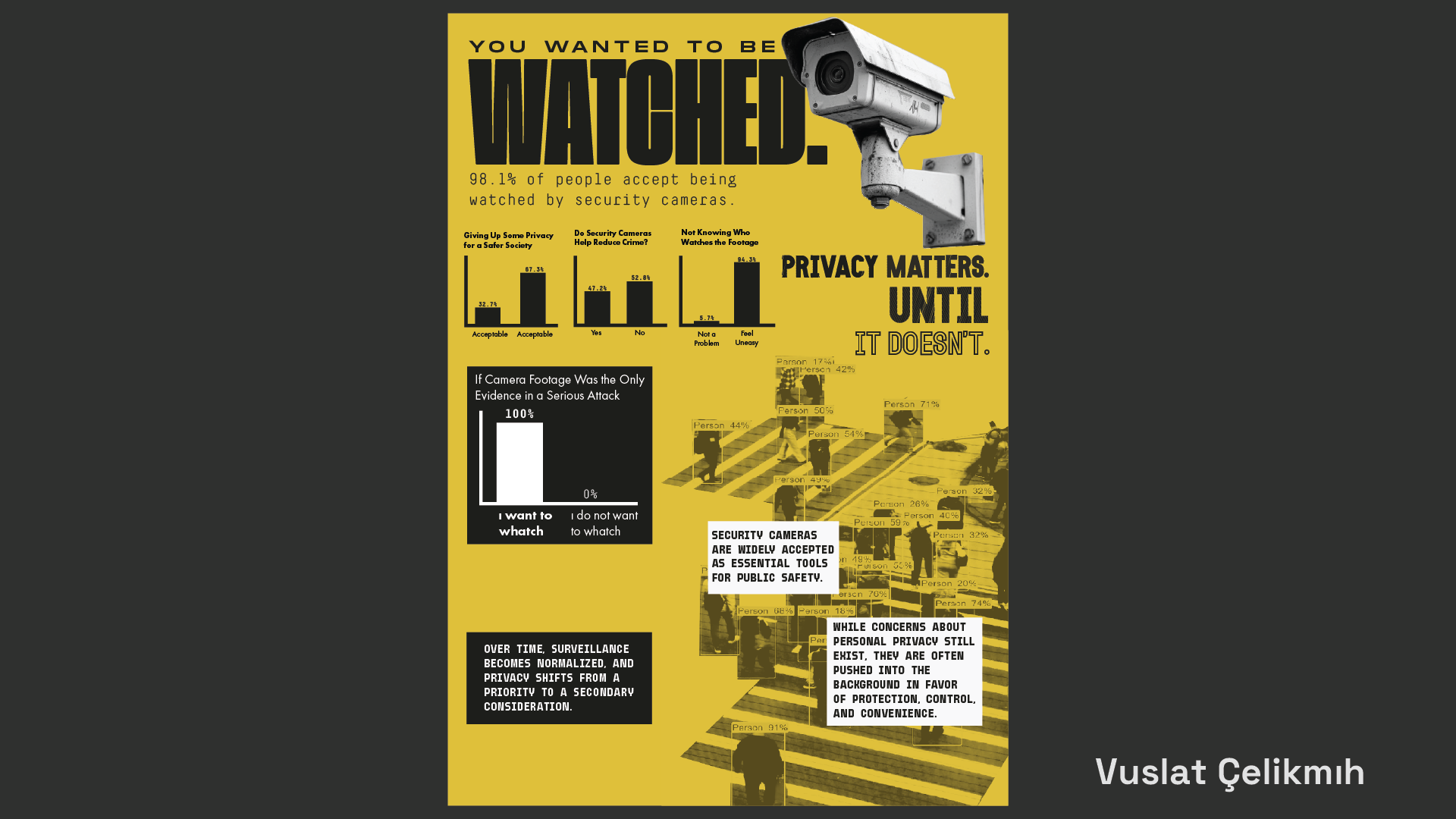
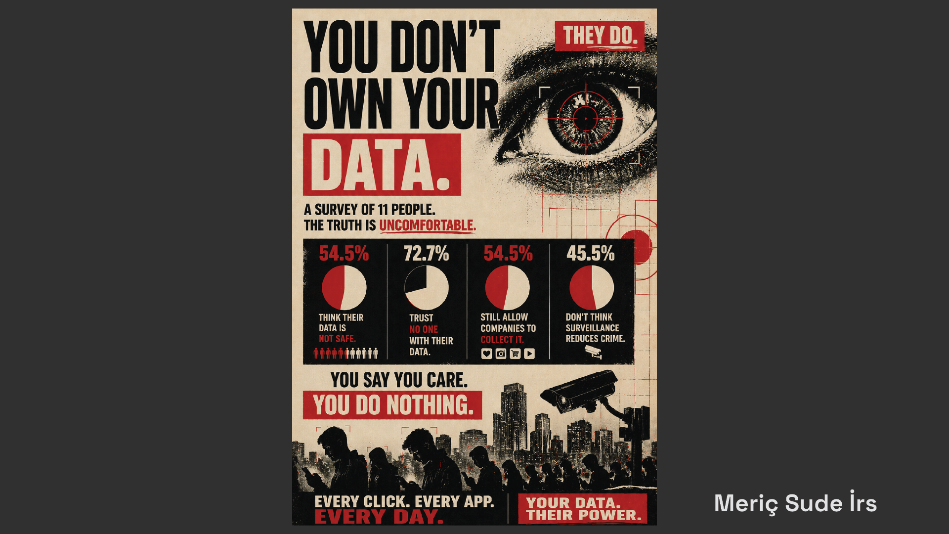
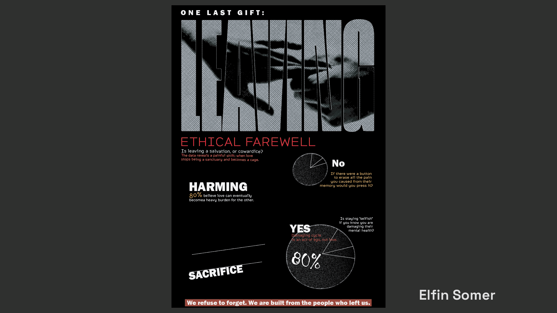
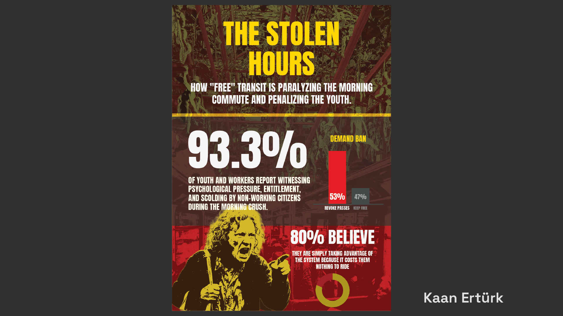
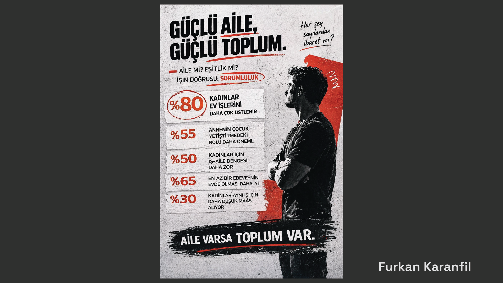
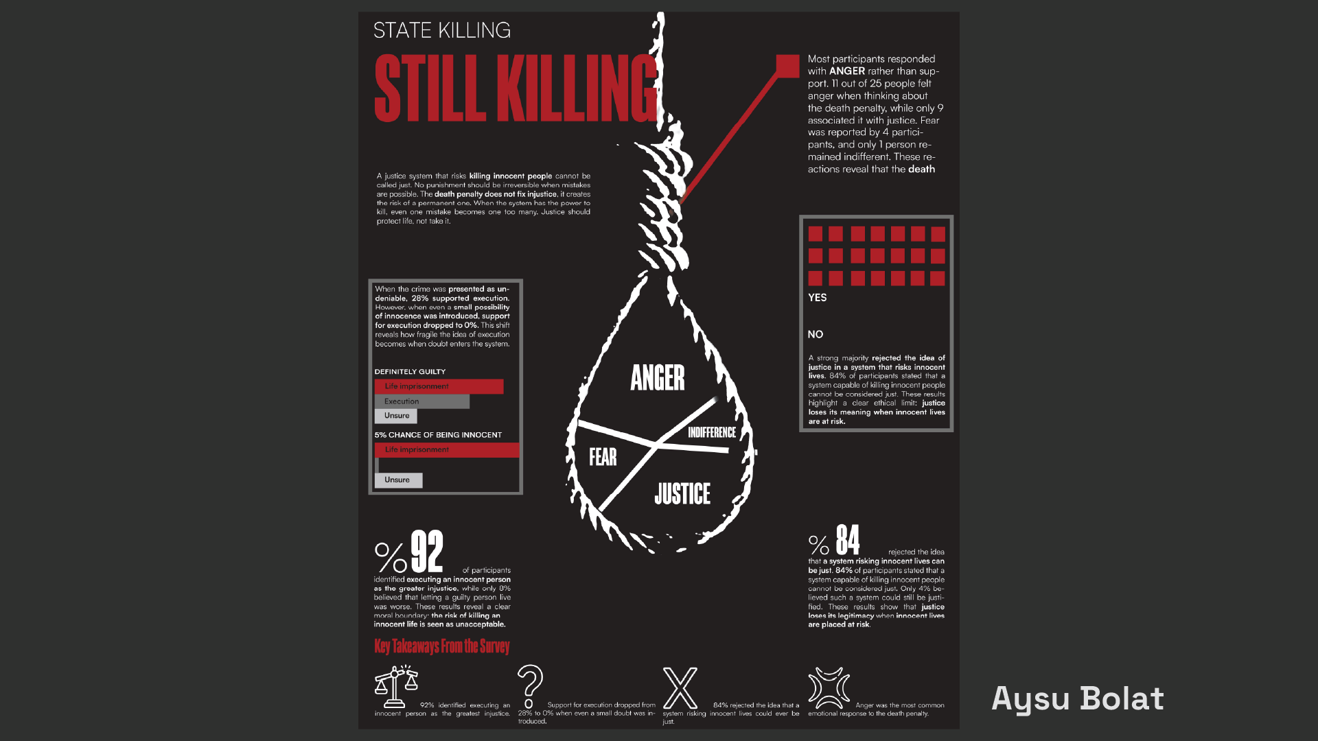
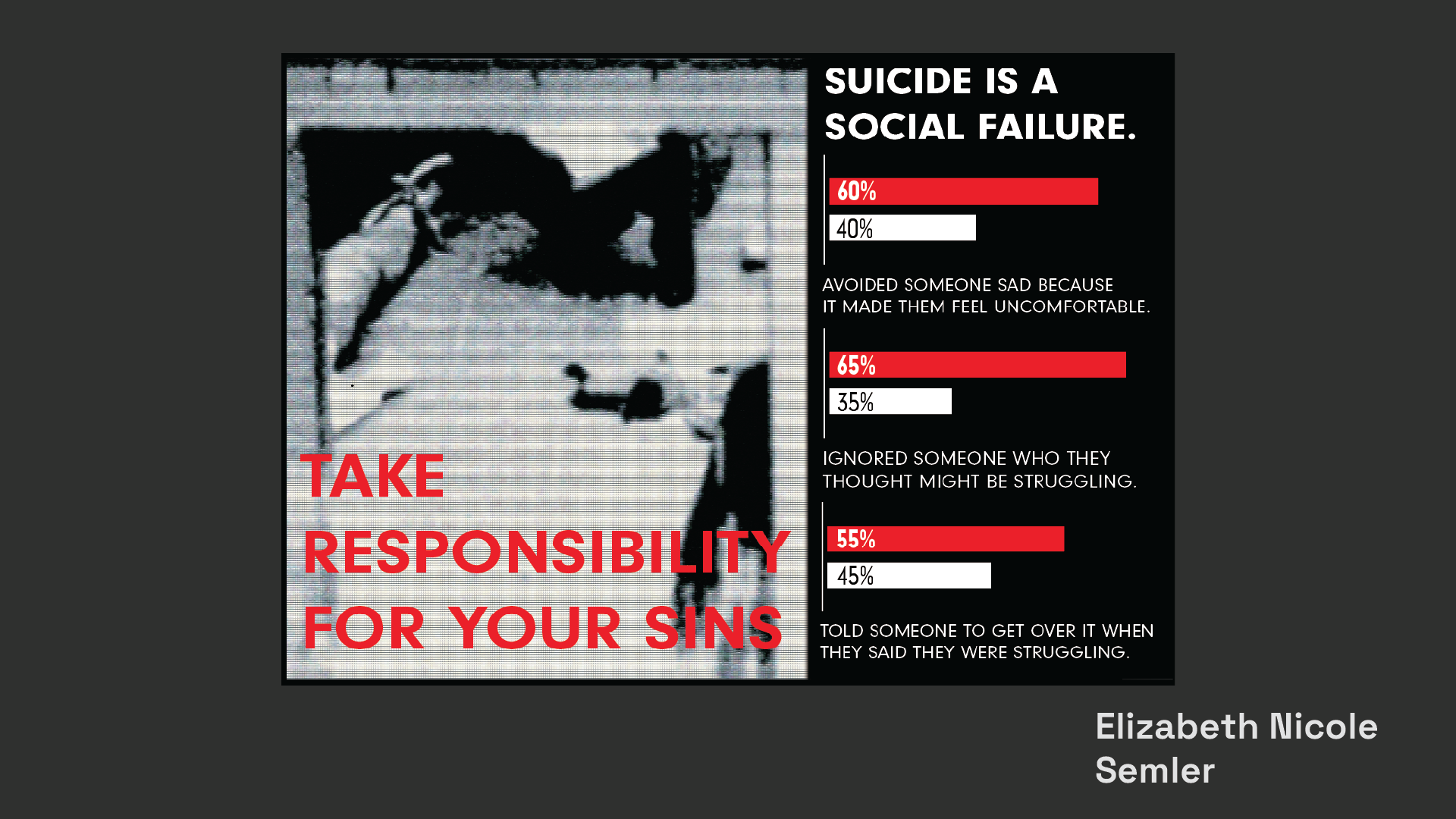
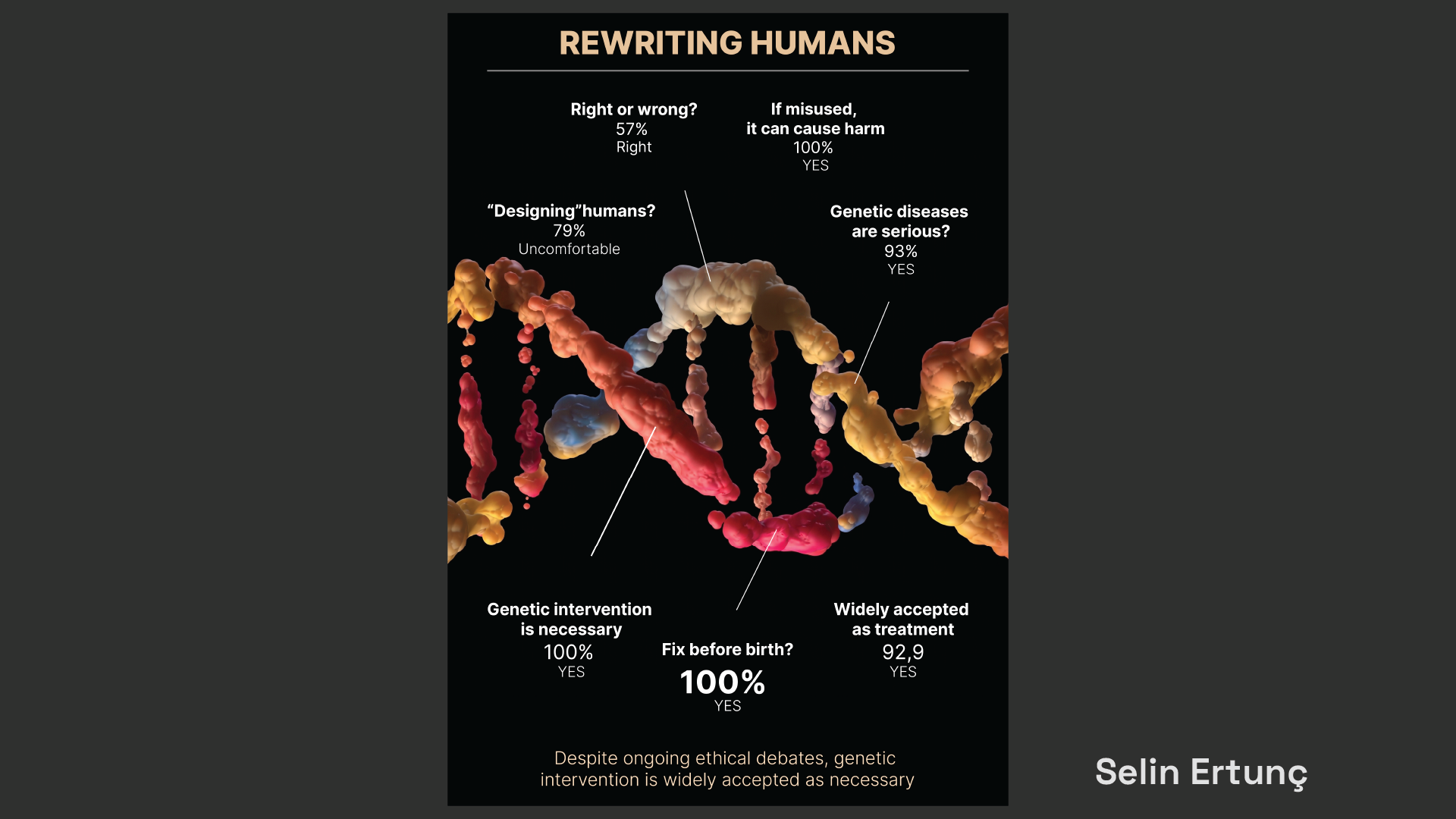
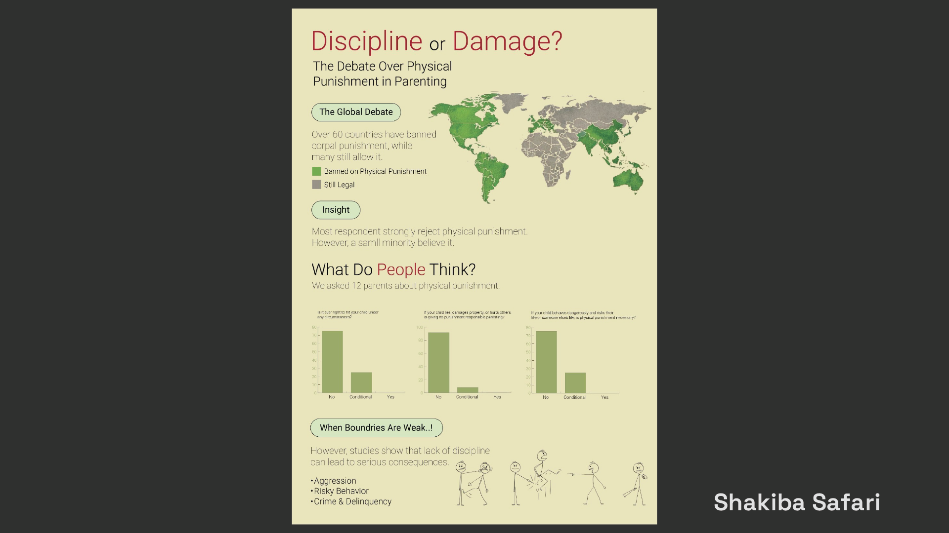
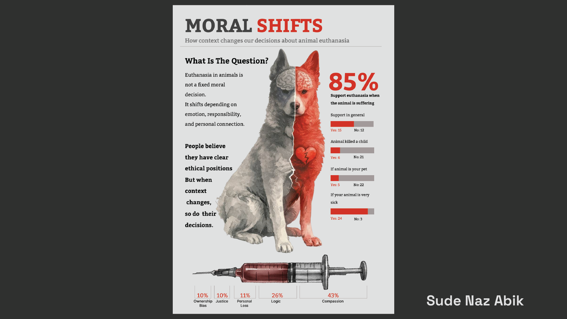
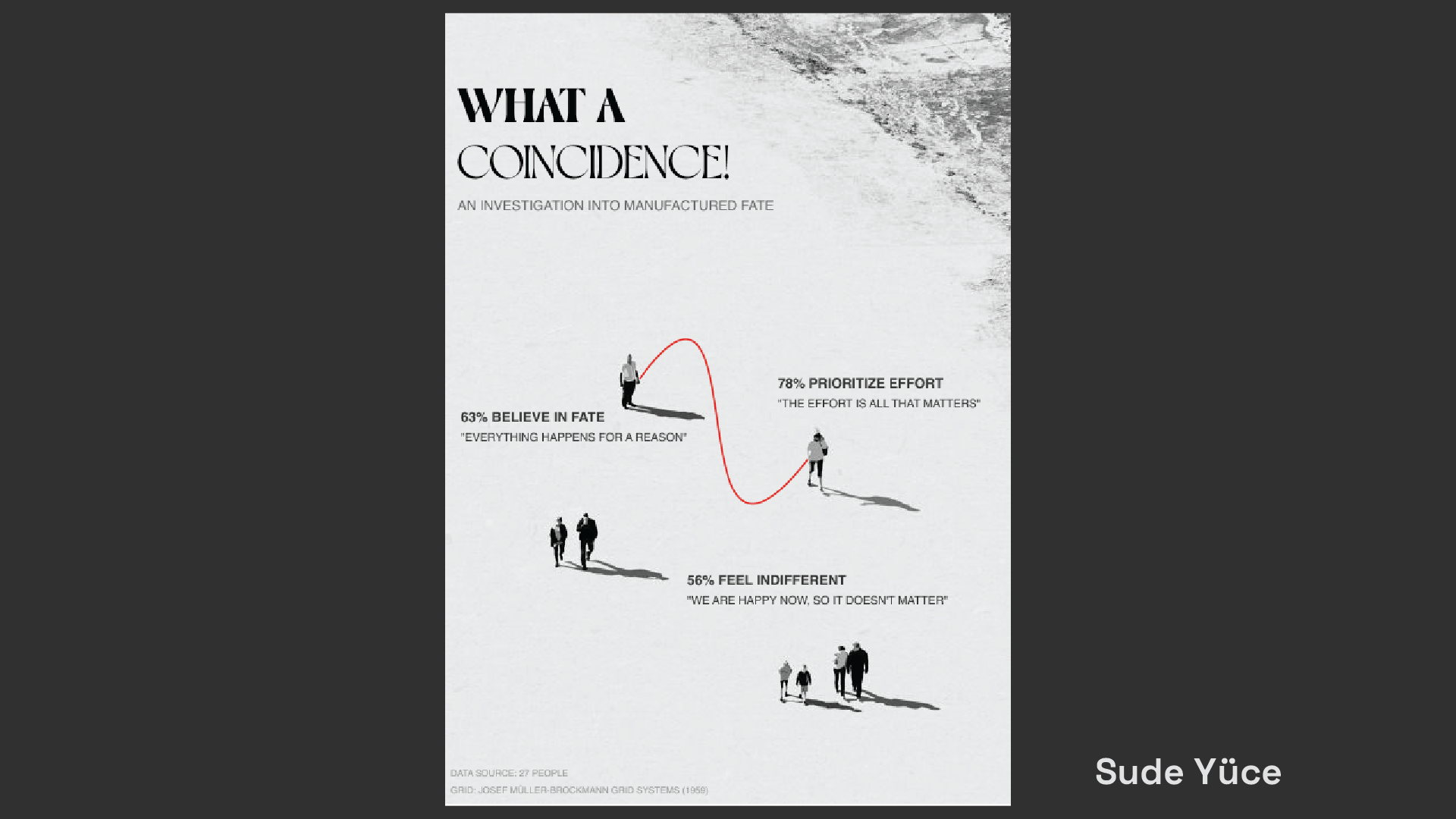
Students take on the role of visual journalists by selecting an ethical dilemma, designing a survey, and collecting responses from at least 25 participants. They then analyse the resulting data and transform it into a clear, engaging, and visually distinctive infographic.
The project asks students to consider how headlines, visual metaphors, colour, hierarchy, and composition influence the interpretation of information. Although the final work should appear objective, students are expected to recognise and critically examine how every design decision introduces a particular framing, tone, and point of view.
Selected Student Works
Project 03
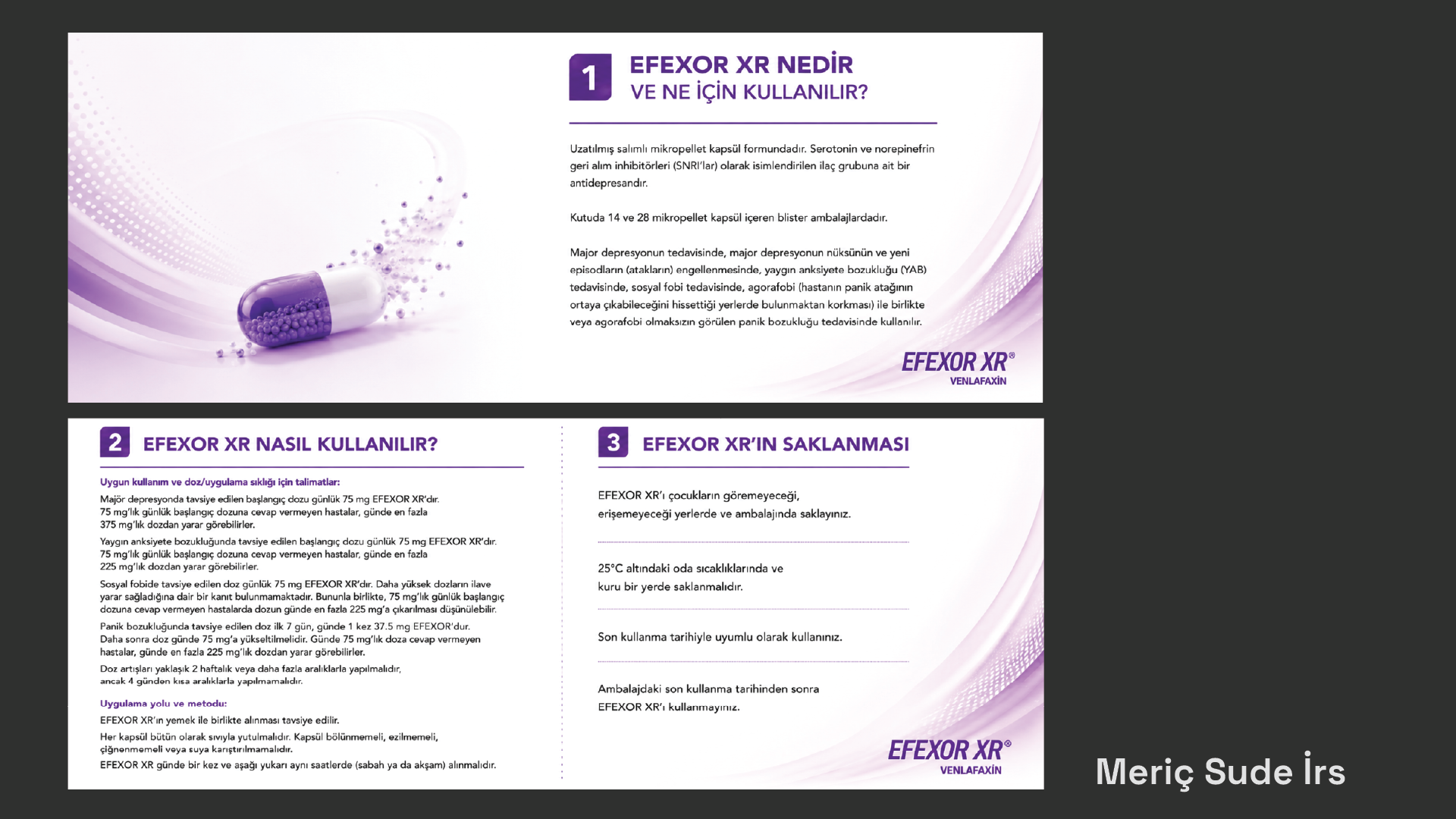
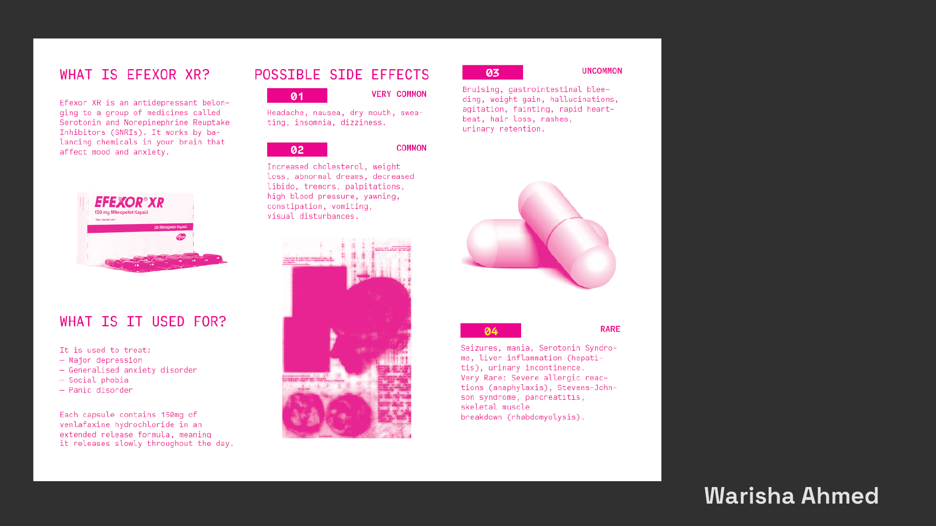
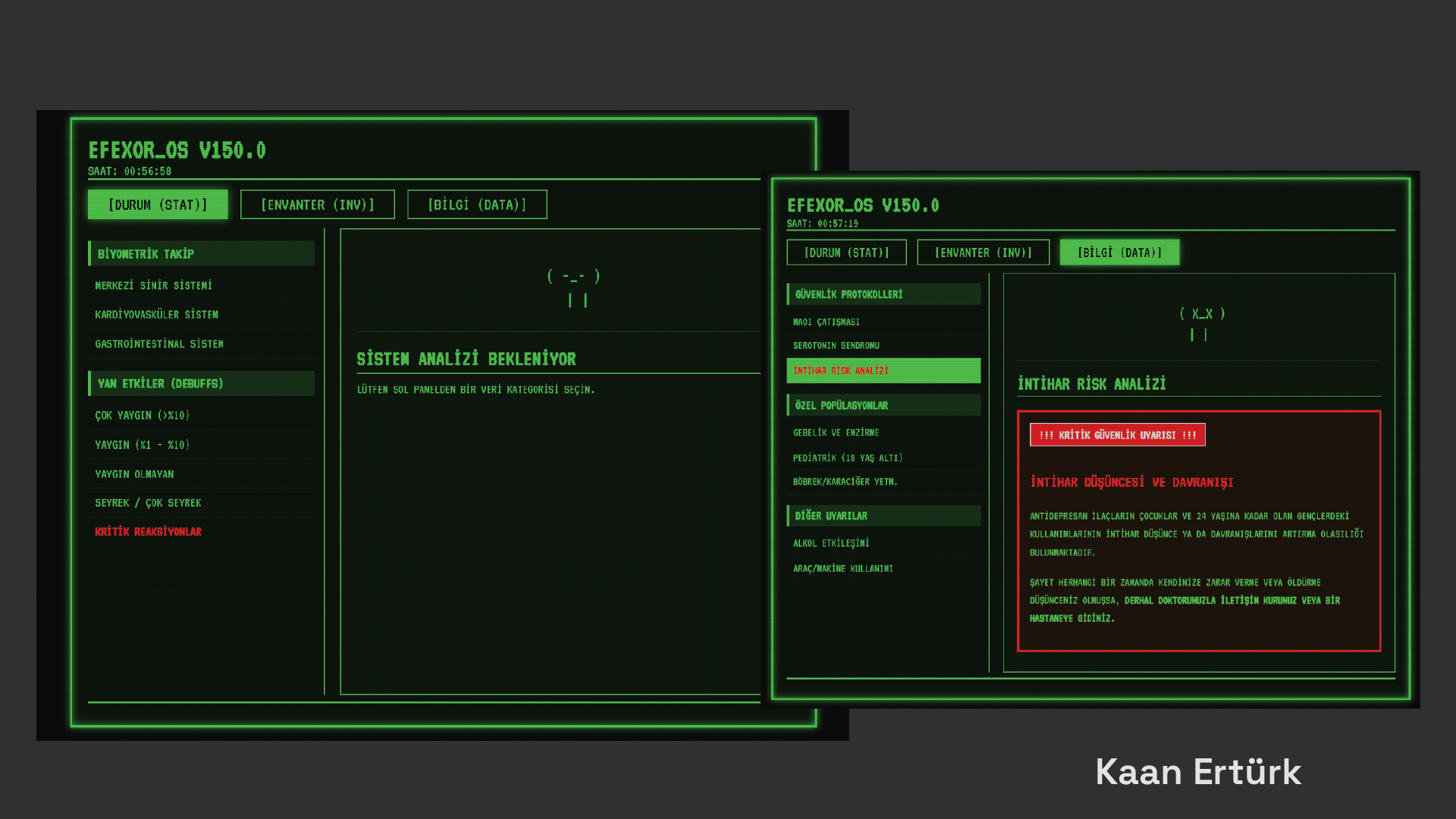
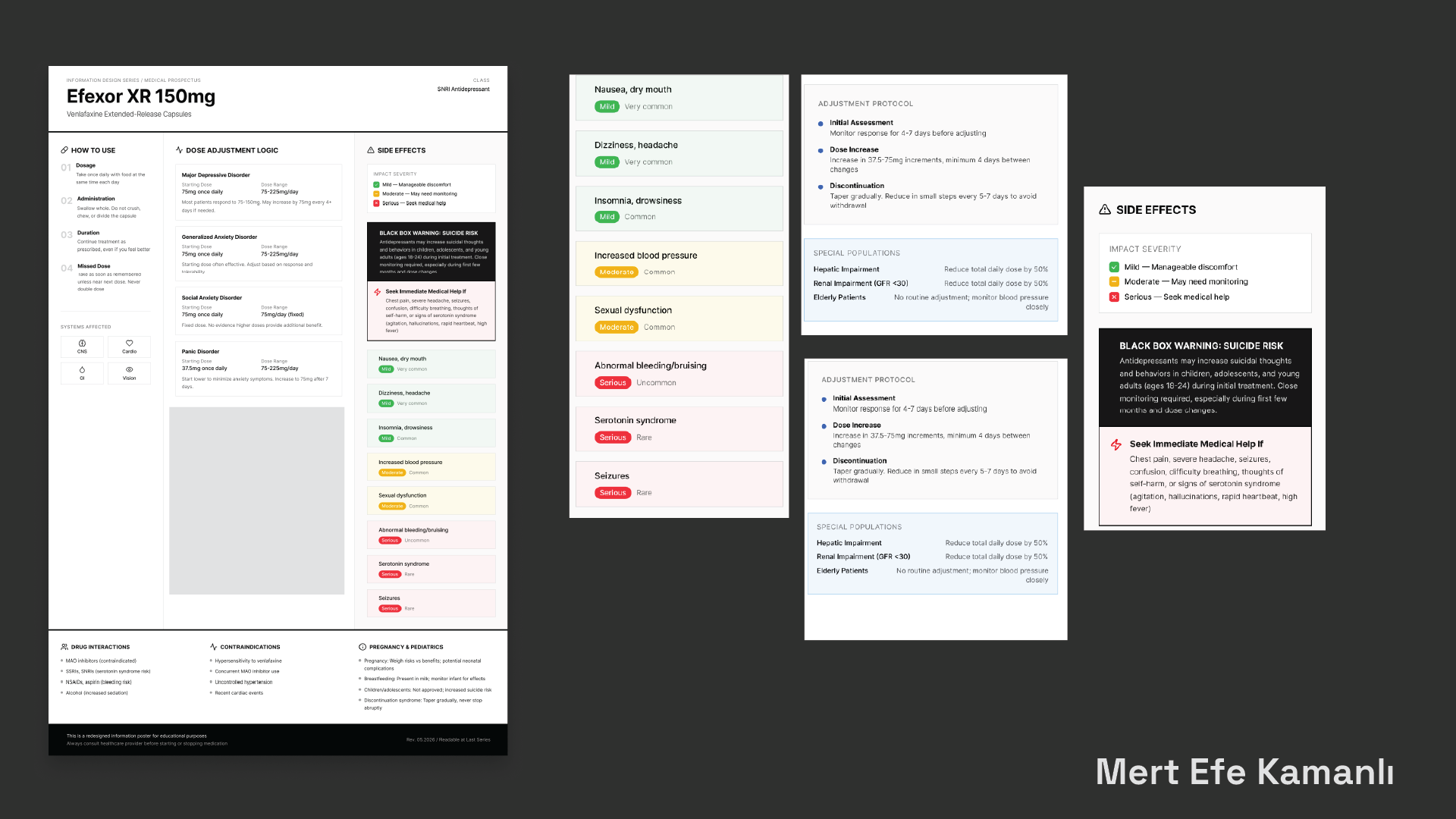
Prospectus Paradox
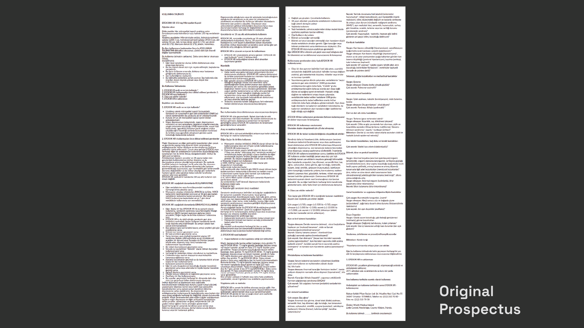
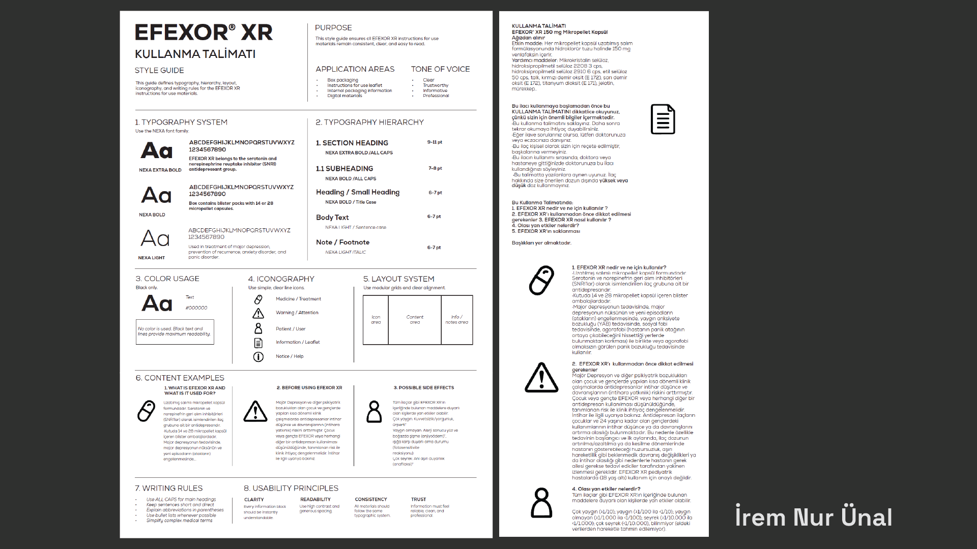
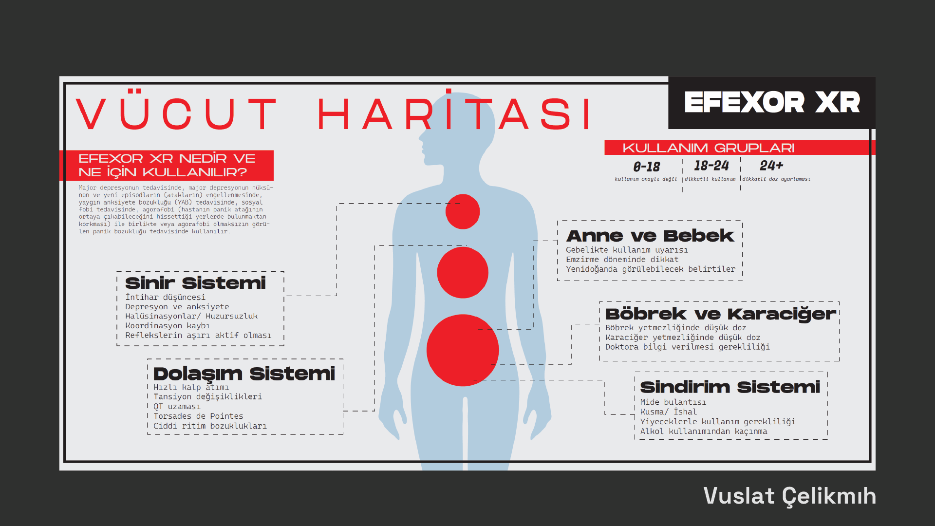
Students design two versions of a pharmaceutical prospectus using the same provided content. The first responds to real production limitations, including restricted space, predetermined folding dimensions, and the need to organise dense information clearly within a compact format.
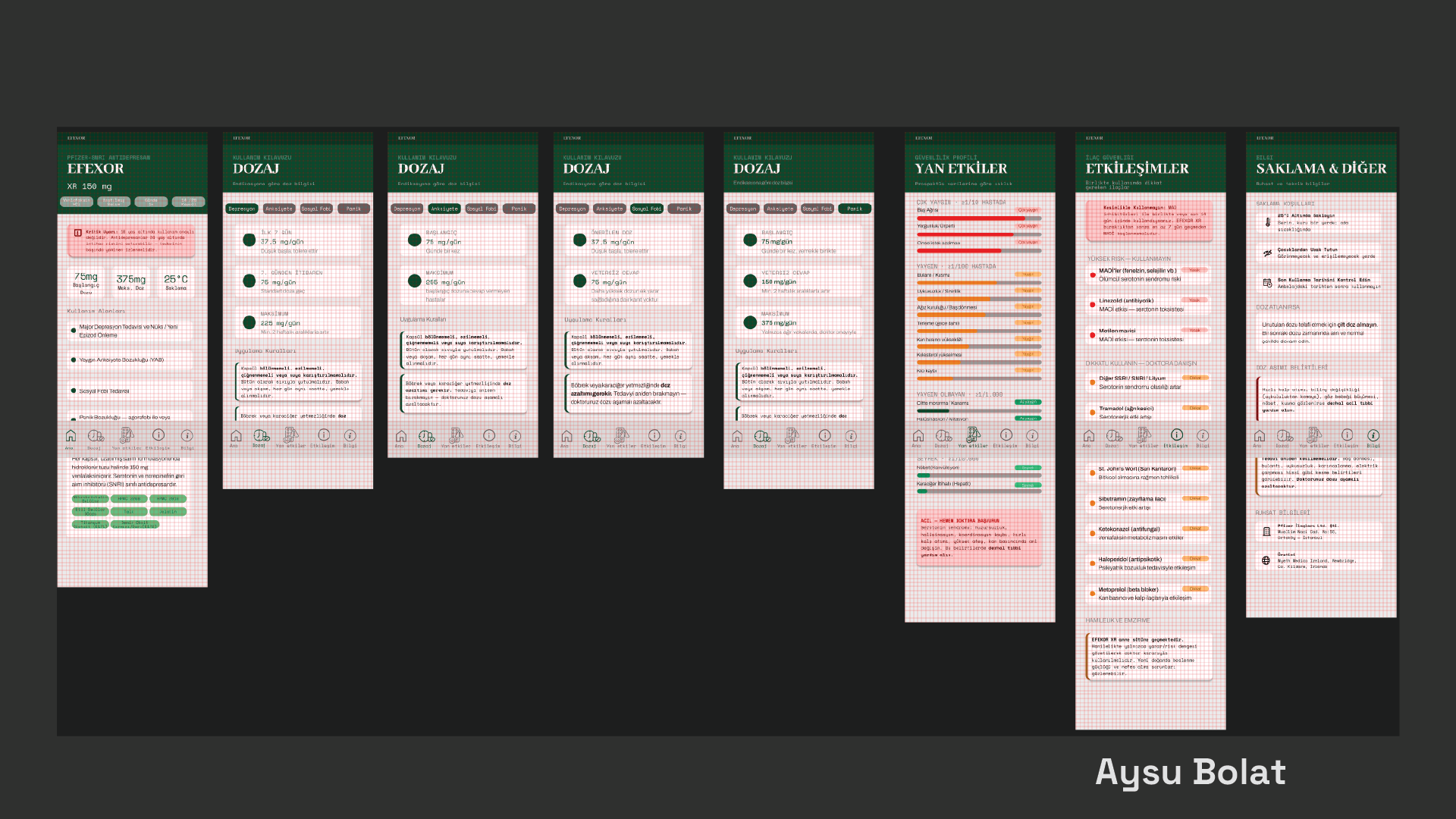
The second version removes these constraints and asks students to imagine a more accessible, engaging, and user-centred way of communicating the same information. It may take the form of a poster, booklet, scroll, interactive object, or another appropriate format.
By comparing the two outcomes, students examine how material restrictions, typography, hierarchy, format, and empathy influence the clarity and accessibility of essential information.
Selected Student Works
Project 04
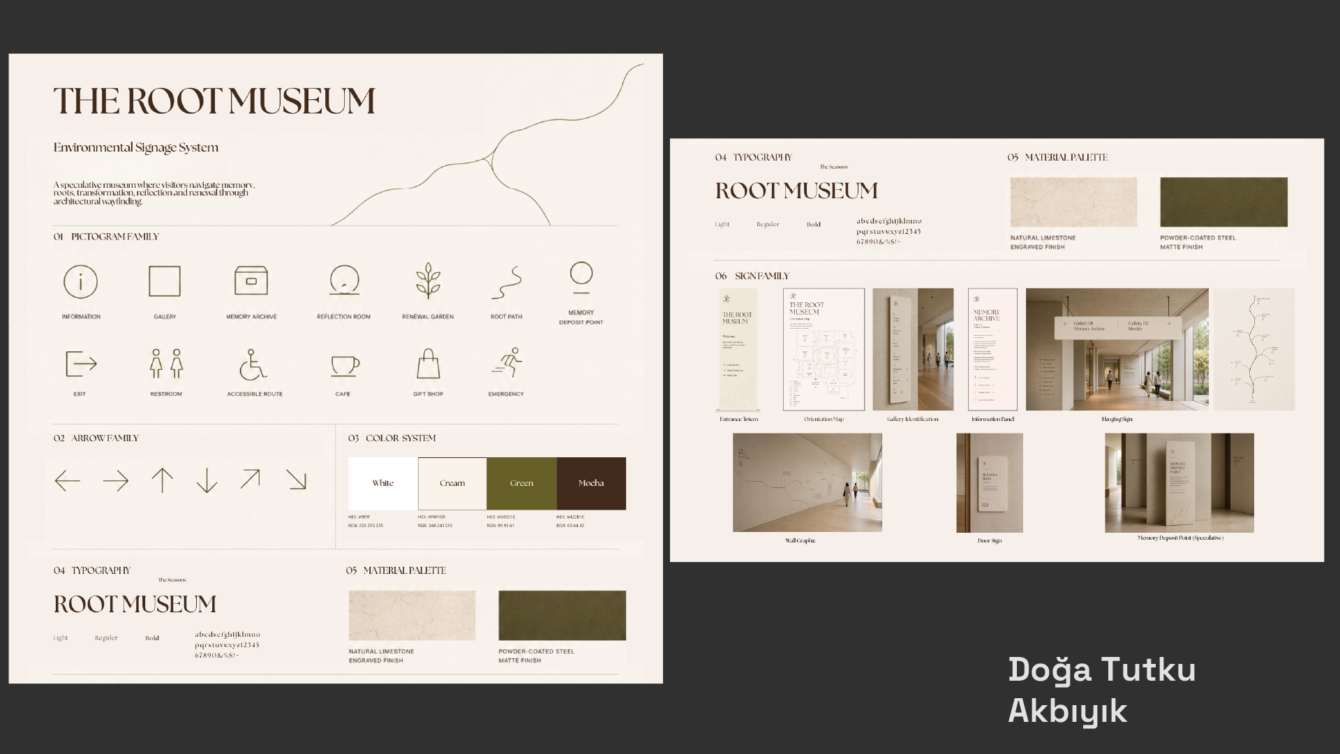
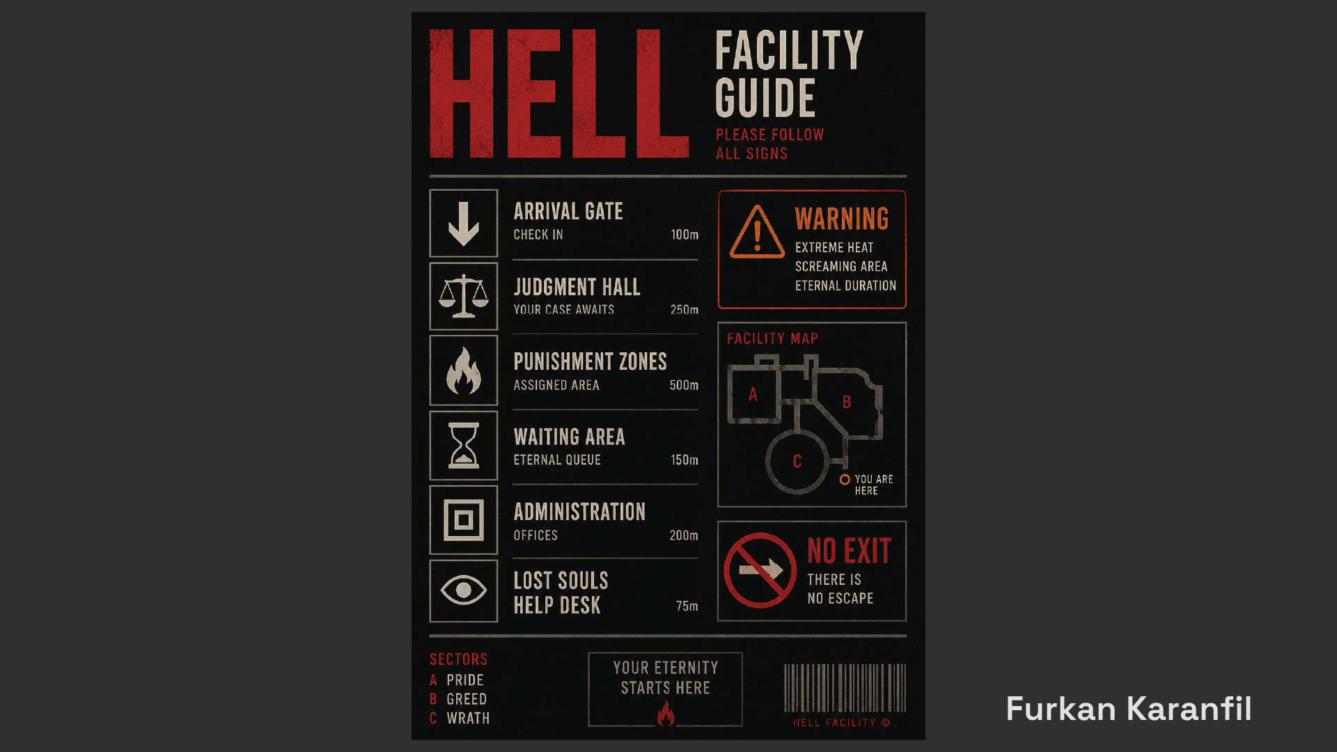
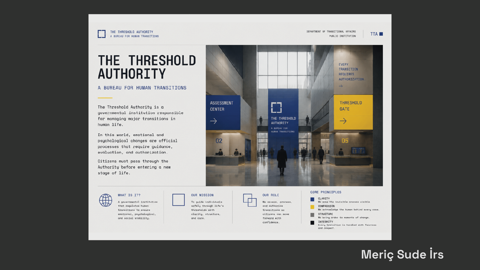
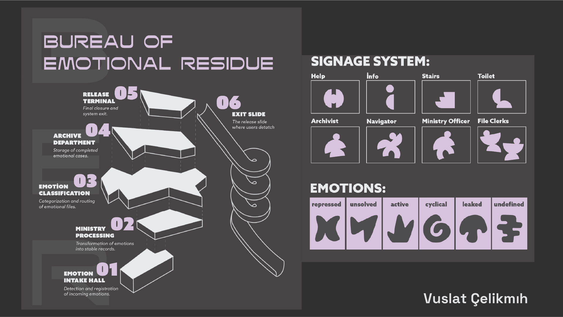
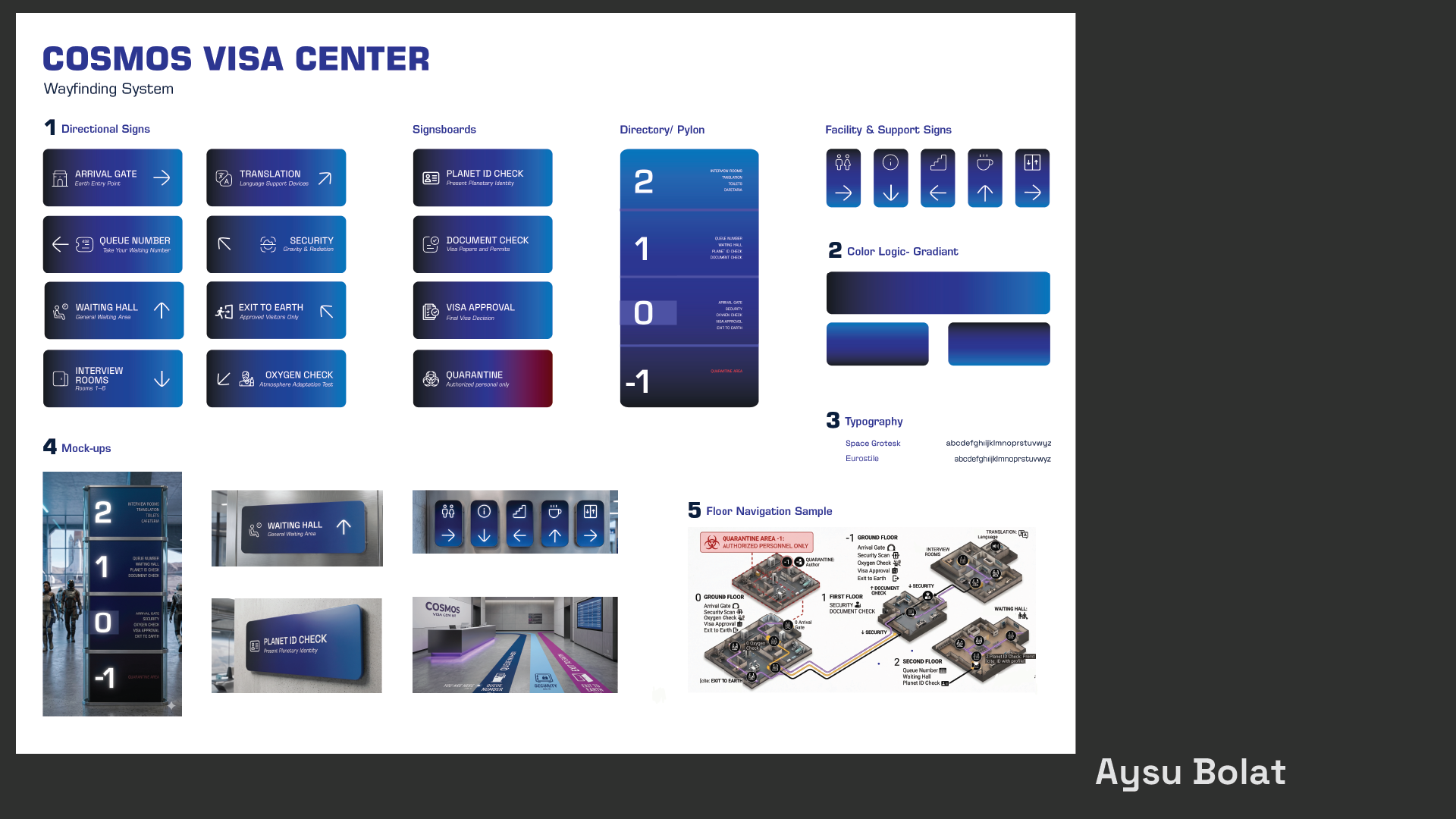
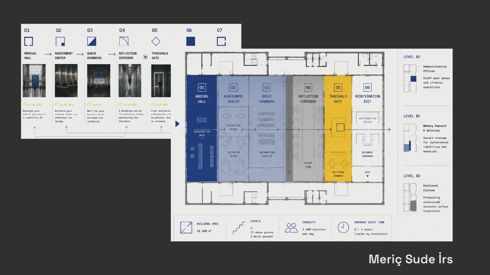
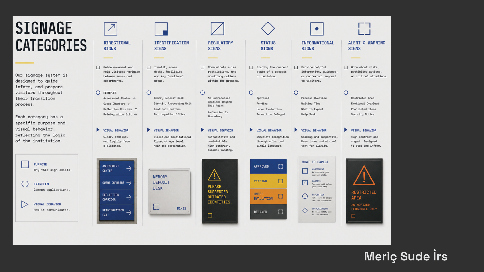
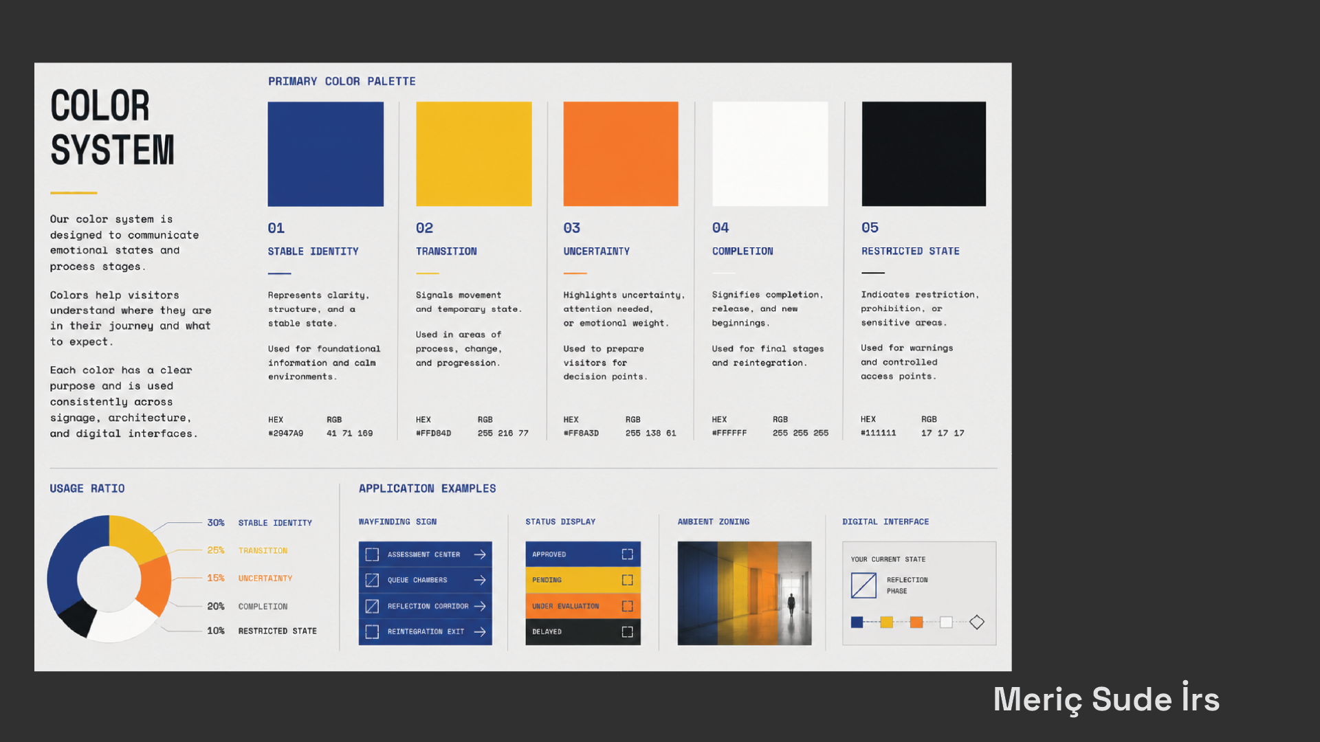
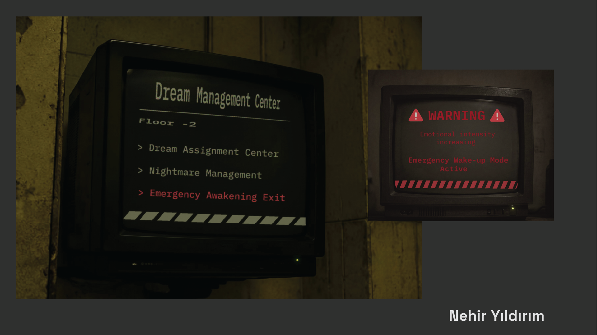
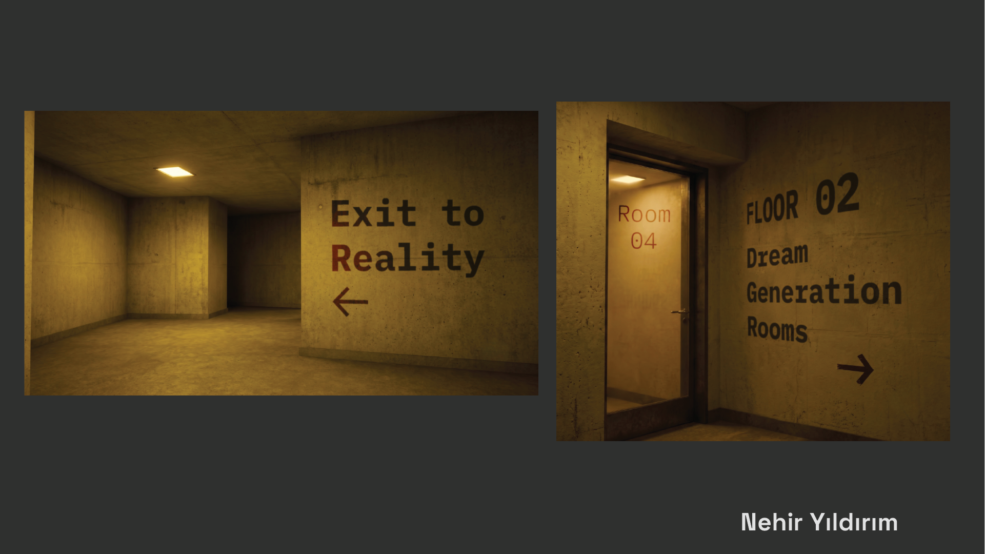
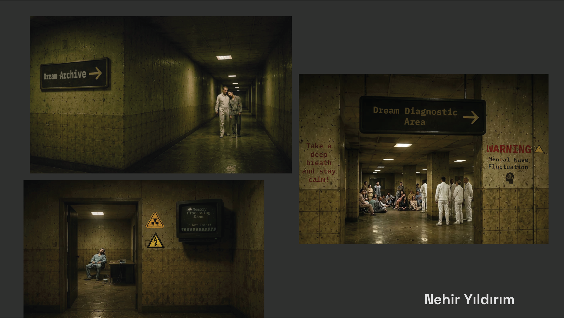
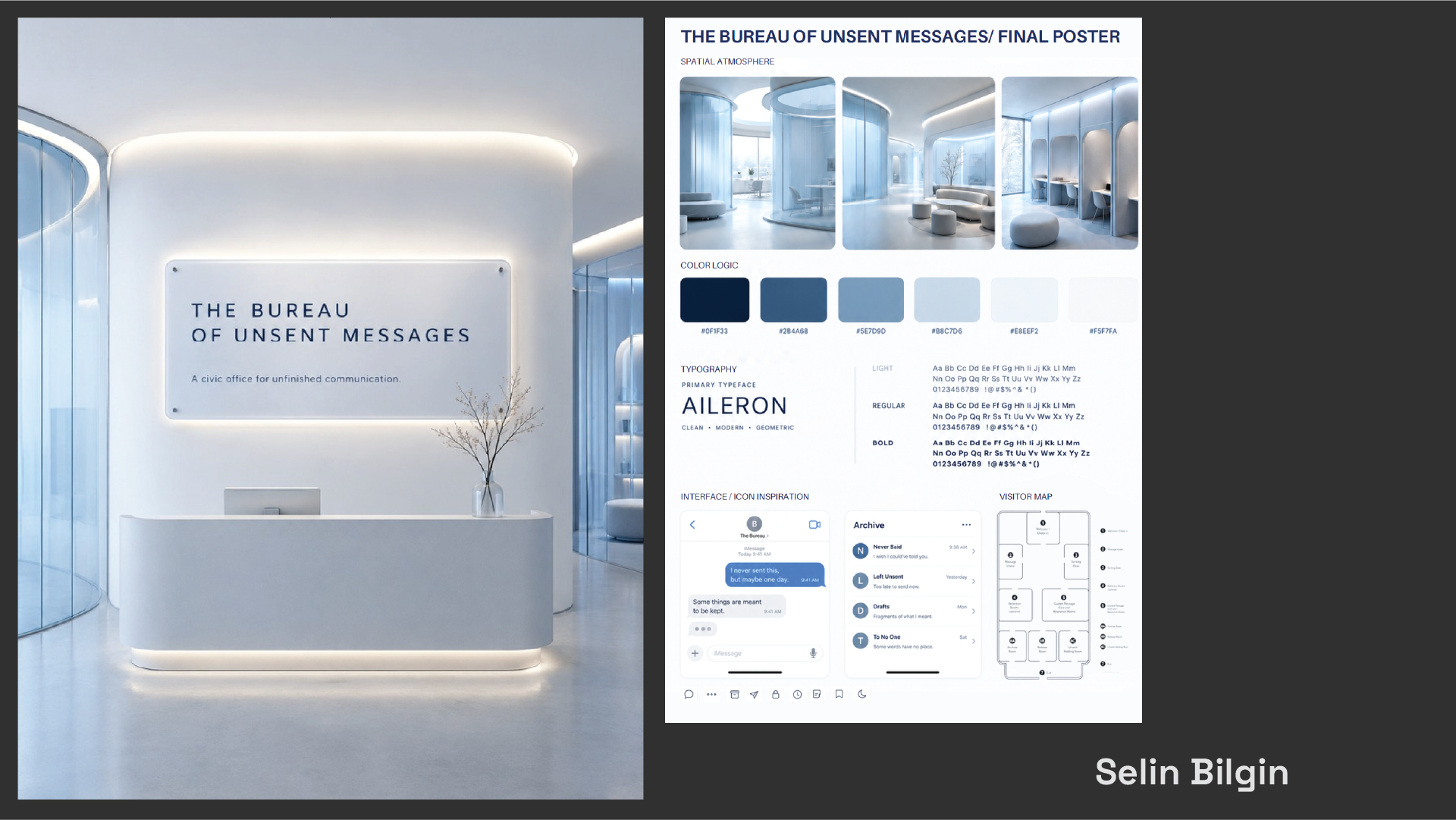
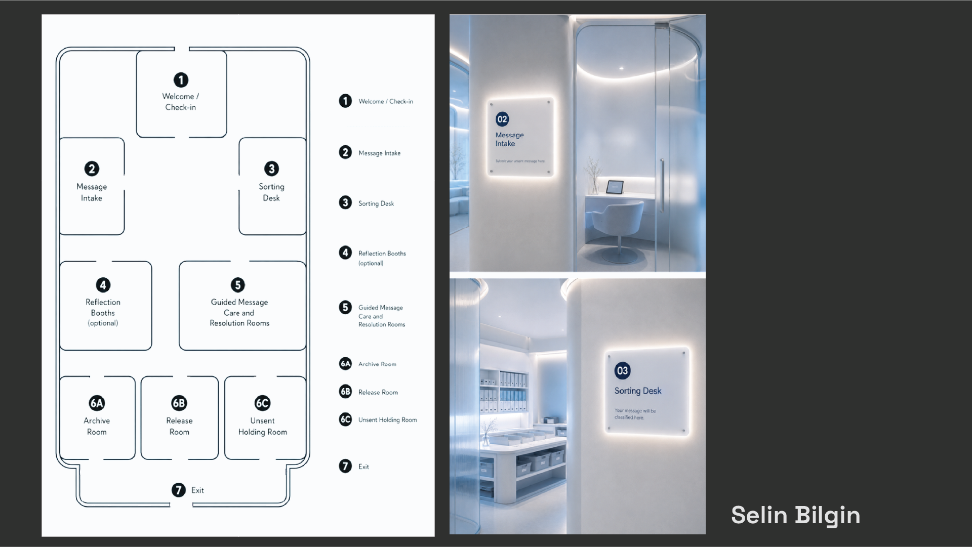
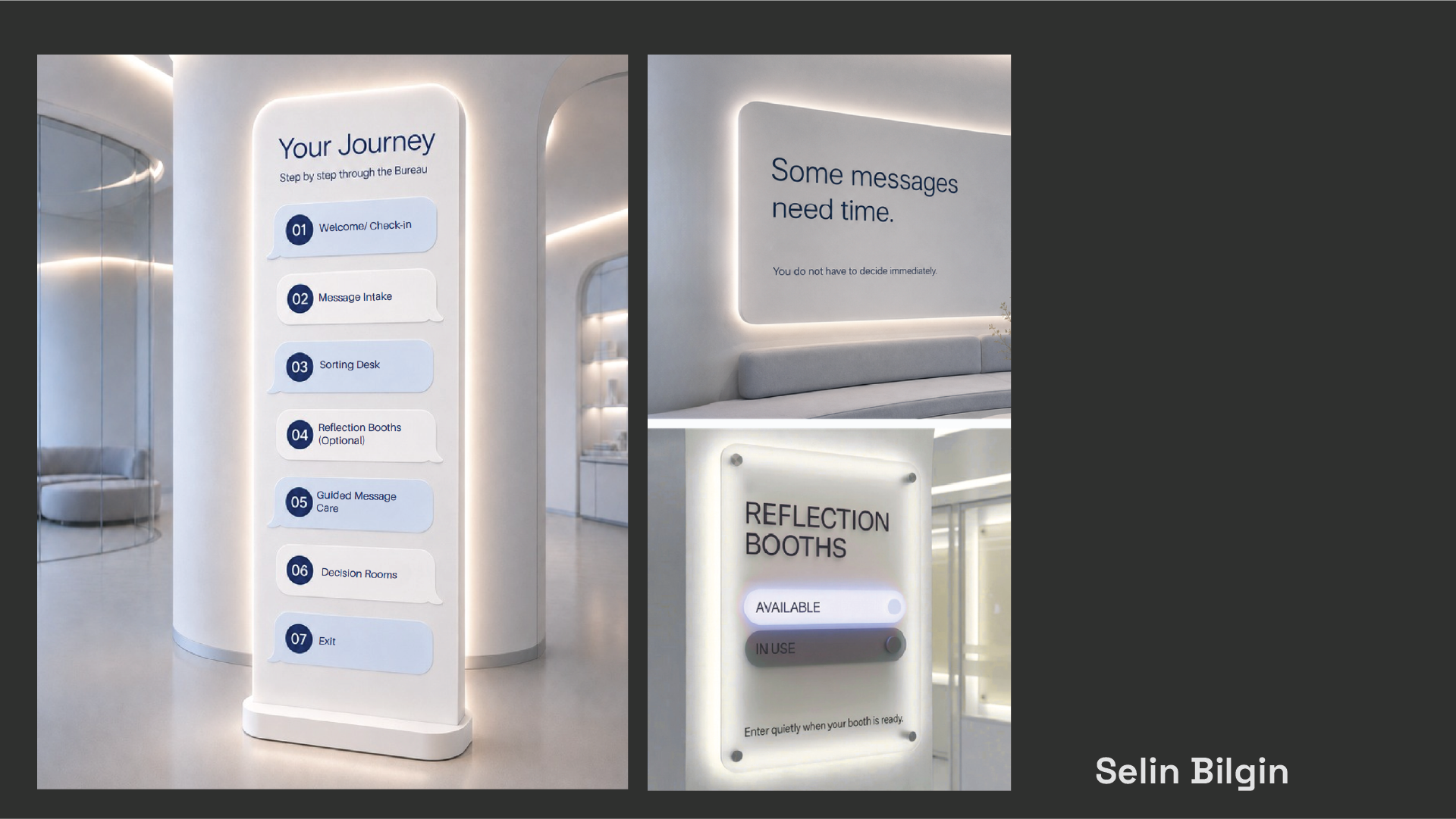
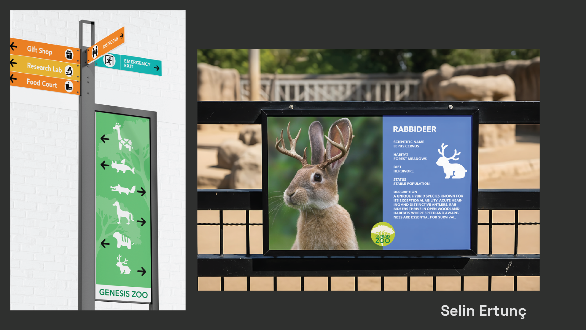
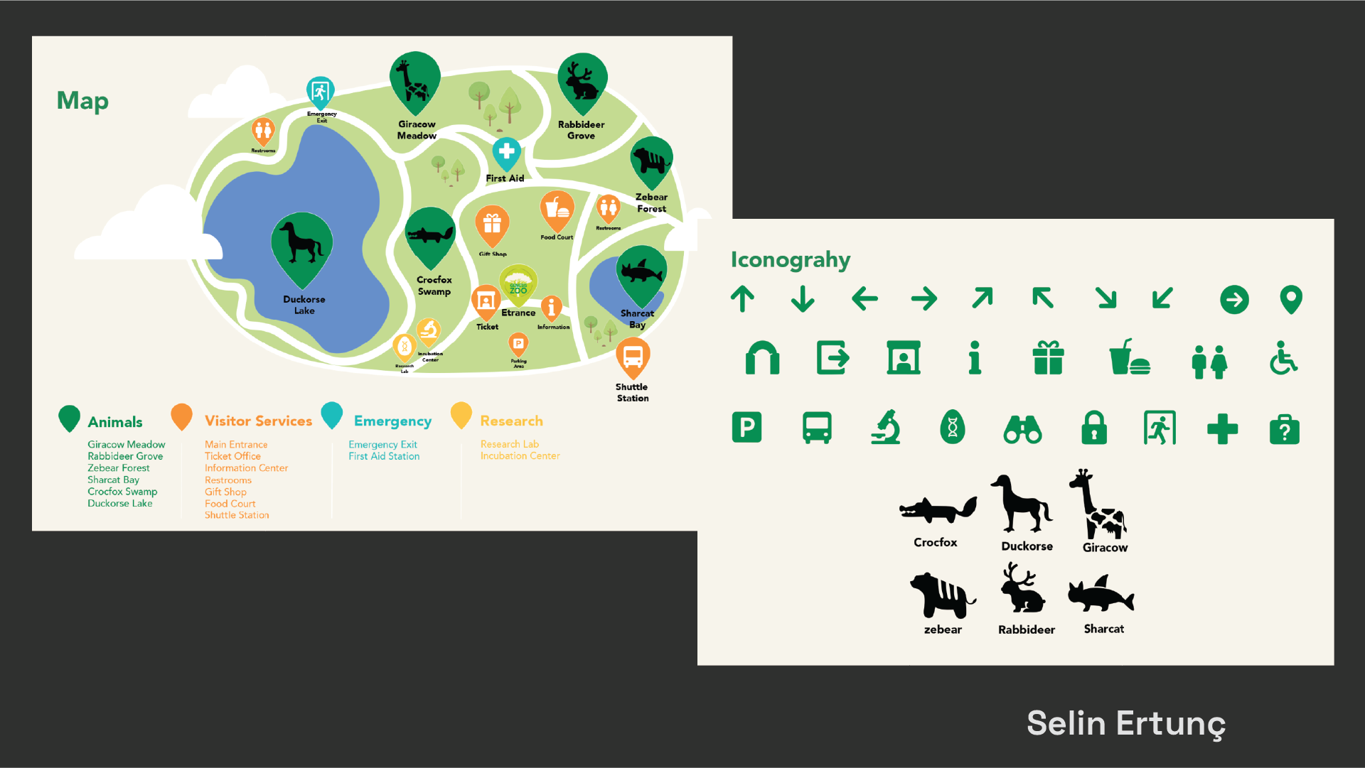
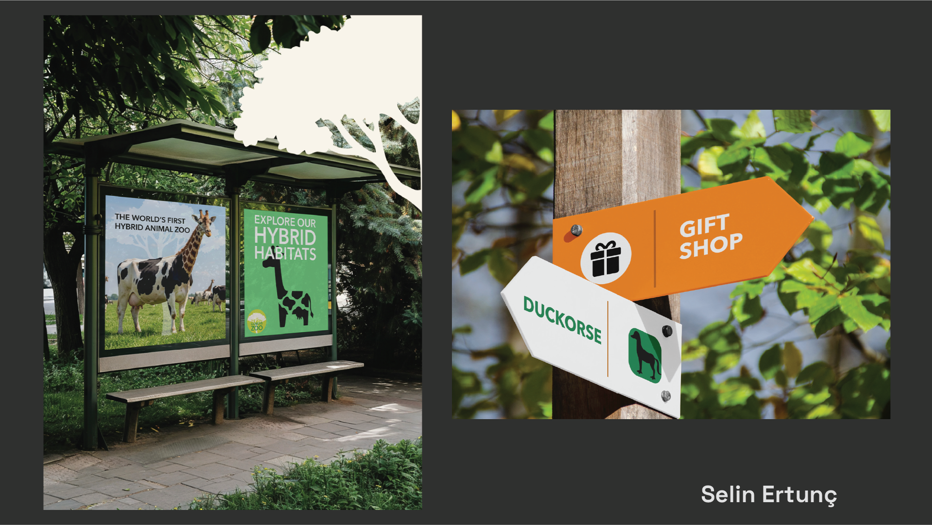
Signage for Nowhere
Students invent a fictional space and define its purpose, architecture, users, and cultural logic. The setting may be poetic, bureaucratic, speculative, absurd, or fantastical, but it must function as a coherent world with specific navigational and informational needs.
They then develop a complete signage system for this environment, including symbols, typography, colour, materials, and rules of application. Every design decision should respond to the identity of the place and the behaviour of its imagined users.
The project asks students to combine world-building with systematic visual communication, creating a signage language that is functional, internally consistent, and culturally specific.
Selected Student Works